28
Feb
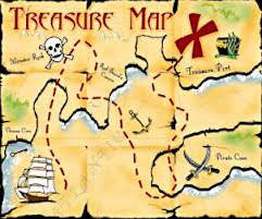
Does your website contain buried treasure?
We’re being serious! When a new visitor arrives on your website, to what lengths do they need to go, to find your products, your services, and the place they need to be to become your customer?
We did an in-house study recently, simply by looking at a sample of different commercial websites online. We discovered that a large percentage of them were not creating a visible and easily followed path for customers to follow leading straight to the check-out. This situation must be affecting their levels of sales revenue.
You see, sometimes, it’s not about attracting even more people to your website, sometimes boosting sales, is about making sure they can find what they are looking for when they arrive. Have a look at your bounce-rate on Google analytics. Trace it and follow it over a couple of weeks, and look back at the last few months figures. If you have a consistently high bounce rate, your problem may not be in attracting visitors, but keeping them.
Don’t treat your new visitors like pirates by giving them a cryptic map to follow in order to find their well buried treasure. You need to make it so obvious, clear, and almost lead them, like Handsel and Gretel, with little breadcrumbs, to exactly where you need them to be. This is not a sales tactic, you’re being helpful! And your bounce rate will prove it. Customers who get lost, or can’t find what they are looking for quickly, most often just click off and go elsewhere.
Add call to action buttons like, click here to view products, buy now buttons and so on. You can call these links whatever suits your business brand. The point is that from the home page, it must be clear to a new visitor that they are only one or two clicks away from finding what they are looking for. Use your landing page to promote different departments, e.g. for fashion retailers, you may have noticed that they will include boxes on the home page for men, women, shoes, accessories and so on. Add another button taking them straight to the Sale pages. You direct your traffic toward the check out by using clearly visible and eye-catching links and buttons. It really is as simple as that.
If you want to keep visitors to your website and turn them into paying customers, show them the way by making the path to the check-out clear, visible and easy to follow.


Enjoyed every bit of your post.Thanks Again.